Estimated read time: 1 minutes
See here for a 3.6/4.0 version of this post.
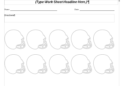
I’m posting here a few screenshots showing improvements in our DOCX filter, done in the 4.1 development cycle. In each case I’m providing a link to the test document, a screenshot showing how it looked before and how it now looks on 4.1. Click on the images to get a larger image:
-
document with a complex groupshape: multiple shapes had text (test doc):
-
document with tabs over the margin (test doc):
-
document with rotated text: content should not fit the cell size (test doc):
-
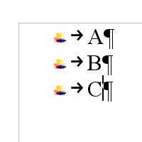
document with numbering, where bullets are pictures (test doc):
-
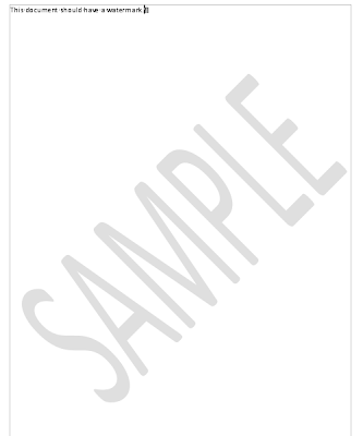
document with watermark (test doc):
If you want to try these out yourself, get a daily build and play with it! :) If something goes wrong, report it to us in the Bugzilla, so we can try fix it in the next 4.1 bugfix release. And remember, there are lots more improvements coming in LibreOffice 4.1, stay tuned!


